- December 25, 2024
-
-
Loading

Loading

When the South Florida Museum opened in Bradenton in 1947, no one questioned the validity of it being southern Florida.
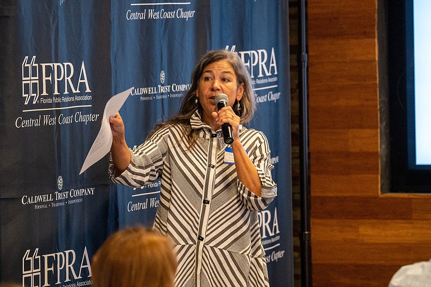
It wasn't until 2007 that a rebranding was in order. Martha Wells, who worked at the museum for 11 years, recently detailed what went into that project, during a conference in Sarasota hosted by the Central West Coast chapter of the Florida Public Relations Association.
Her experiences there are something of a roadmap for how a company can attack the complicated task of rebranding. In the case of what was the South Florida Museum, that includes a new name: it's now called the Bishop Museum of Science and Nature.
In 2007, the organization set a strategic plan that identified a concern the name was holding it back. What does South Florida Museum really mean? What does it evoke? What kind of museum is it? It’s not really South Florida anymore, is it? These are just some of the questions the team was asking.
Wells says they honed in on the concept that the museum’s brand was about providing an experience. In 2012, a new strategic plan was put in place to identify a capital campaign that would lead the rebranding. It included plans for a new family-oriented wing.
A marketing committee made of trustees and staff was created to come up with an identity for the museum that reflected how it was seen to the public and how it wanted to be seen. The big idea the museum was working toward? The notion it was an entity contributing to protecting, interpreting and communicating knowledge of science and nature.
A big help to the rebranding was how easy going the board was throughout the process, Wells says. They understood the investment and that it would require a lot of different viewpoints in and out of the organization.
“They also understood and acknowledged that consultants can say things to the board, the decision makers, that staff can’t,” Wells says. “And occasionally consultants can say things to staff that the board may prefer not to say.”
Through an agency selection process, the museum hired a project manager that helped determine the right process for the team and made sure that no one voice was being heard above the rest. The initial request for proposal did not include a budget, which was done intentionally. Instead, it only included a timeline.
“We wanted to hear the best that everybody had to offer,” Wells says. “Then when we invited them to come in for presentations, we gave them the parameters of budget so they could scale appropriately.”

The first phase of rebranding was research. The second phase looked at the museum’s visual identity. All of this required asking for staff and board input, community-wide surveys and strategic audience research. The strategic audience research was completed through two focus groups in the area, including residents who identified as museum-goers.
“Those focus groups were absolutely painful,” she says, “but in no way surprising.”
The museum learned it hadn’t done enough marketing and that its labels were confusing. “We confirmed that nobody knew who we were,” she adds.
For community input the museum conducted member and visitor surveys, as well as held stakeholder surveys and interviews.
“We found that there were a lot of times where people want to do research just because (they) can so we ended up with data that we didn’t know what we were going to do with,” Wells says. “Don’t gather data just because you can. Know what you want so that you can work with it and not be overwhelmed.”
Through all of that research, the museum discovered that potential visitors were most interested in visiting a natural history museum or a museum of science and nature.
“That helped us validate that there’s a market out there for us,” Wells says, noting it also helped pick out the name.
Then came the design phase.
The B in Bishop is designed with an “impossible” style, a model made famous by M.C. Escher and the impossible cube. The idea is that it cannot be created in three dimensions.
“That was part of the idea of curiosity,” she says of the museum’s brand.